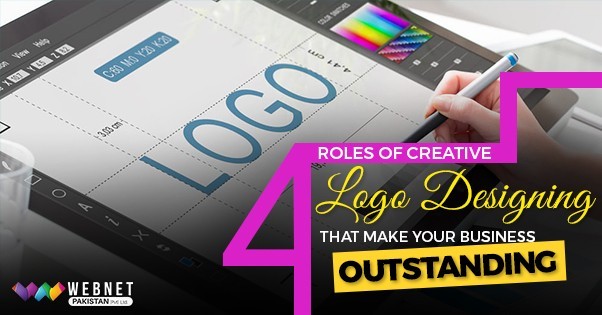
6 Logo Design Mistakes to Avoid for Better Branding
A logo showcases your business values. It builds your brand persona by highlighting its essential traits.
In this digital age, more people are supposed to recognize your brand through your logo due to the massive influence of the internet.
Although logo design is time-consuming, it is important to have a clear idea about the loopholes that can create issues.
It is better to learn before than to learn by committing a mistake. So, you should know different logo design mistakes to avoid.
A unique and straightforward logo lasts long in people's memory and is essential in increasing your brand awareness.
People have a particular cast, creed, nationality, religion, or color that becomes their identity. Similarly, the logo is one of the most integral parts of your corporate identity, showing the world who you are as a brand and what you do.
It means you cannot afford to have any defect in your logo for the sake of your brand reputation.
You have to develop a flawless logo that can compel the audience to be interested in your brand.
Let's explore common mistakes that will help you create a perfect and appealing logo design.
Not Putting Yourself in Brand's Shoes
The logo design process starts with understanding the brand. You must dig deep to know what products and services a brand offers.
It is about communicating your brand's essence, so you should know all its pinpoints.
Impatient designers directly go to work with zero knowledge of the brand.
Brainstorming with your team before working on any logo would be best.
It is just like preparing for the exam or gathering the relevant information before writing the essay, right?
So, can you create a mesmerizing business logo if you completely understand it?
Conducting an in-depth brand audit to understand the brand's values and background clearly would be best. This will help you add the relevant ingredients and elements to the logo and reflect the brand's true colors.
Once you put yourself in the brand's shoes, you can create stunning brand appeal by perfectly reflecting it in the logo.
Not Thinking Outside the Box
Sticking to the old-school approach takes you nowhere in life, which also applies to logo design. It would be best if you evolved constantly with time to outsmart your competitors.
If you look at all the top brands' logos, you will notice how unique they are, which is why they last long in people's memories.
For example, when you hear about McDonald's, you can automatically create an imaginary picture of its logo. Because its logo is unique and straightforward, you will not find it in any other fast-food chain.
Take another example of the KFC logo.
You will notice how creative and straightforward their logo is. It perfectly sums up the entire concept, featuring an image of the brand's founder.
You have to develop similar creative logo ideas to rule the heart of your target audience.
To think creatively, you must understand the fine line between uniqueness and clichy.
A perfectly crafted logo must have an everlasting impact.
You do not want it to disappear from people's memory after some time.
It is not worth relying on trends and doing what everybody else does.
Focusing on your business's visual identity can help you think of logo ideas that instantly grab users' attention.
Aim to build your brand identity by going against the flow and becoming a trendsetter rather than doing what everybody else does.
Following Others Blindly
Doing the same thing as others are doing will add zero value to your design.
When striving to build your own corporate identity, you need to reflect your brand values in your logo rather than copying others' ideas.
You can only gain the trust of your potential customers if you bring authenticity to your logo.
People are smart enough to spot any plagiarism in your logo that can sabotage your company's reputation.
Logos are supposed to make you stand out among the brands in the market. So, it would be best not to give anyone a chance to raise a finger on your brand's image.
Although checking every design for similarities is impossible, you should check your closest competitors.
Poor Choice of Fonts and Colors
Maintaining the right logo color and font balance is crucial for your success.
You must choose the right fonts and colors according to your business niche.
Let's say you have a restaurant business. Your logo should be red, as red evokes hunger and excitement.
If you look at the logos of all the top restaurants, you will notice how prominent the red color is. You will see it in all the logos, from Pizza Hut to Burger King.
So, the utilization of color varies according to the industry. You must pick the right color according to your brand values and message.
Now, let's talk about the logo fonts.
Your font choice can either make or break the logo design. Anything over the top can make your entire brand look senseless.
All businesses have their background, so you need to choose the right font according to your brand's personality.
Doing in-depth research about fonts similar to your products or services would be best.
You can play with different font styles and finalize them according to your business needs.
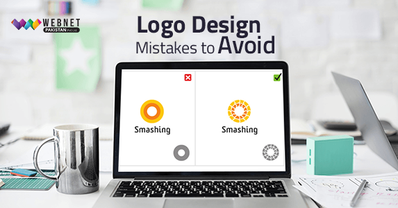
Making it Complicated
Initially, you can be tempted to use too many things for your logo design. But it would be best to stay on top of your design.
A mixture of too many elements in your logo design can confuse your target audience. Your message in a logo should be loud and straightforward and will speak for itself.
One of the most prominent logo mistakes designers make is trying too many things to create something fancy.
They even forget that complicating things kills the charm of a logo and can compromise your brand purpose.
Simplicity is the key to success for your logo, but you have to keep some critical factors in mind.
Versatility, Impact, and Memorability should be your primary concerns while designing a logo.
Your logo should be versatile so you can create it differently without losing its style or appeal.
Memorability is one of the most critical factors associated with logo design. Because a logo's primary objective is to enhance brand recognition, it should be easy for your audience to understand and remember.
Lastly, a logo is all about impact. People should be able to understand a logo by taking a single glance. A powerful impact helps you create actionable strategies for your branding.
To avoid complicating things, you should extract the true essence of your brand and mold it in the purest form as a logo.
A clean, everlasting logo design will create credibility and streamline your branding efforts.
Having No Flexibility
If you look at examples of common logo design mistakes, then you will notice that inflexible logos are good for nothing.
A logo has to be used in different mediums, so it should be flexible to adjust quickly on websites, business cards, brochures, and everywhere else.
A flawless logo can go well with all sizes and platforms, so you must ensure flexibility to have a distinctive identity.
Conclusion
Committing a mistake is not a mistake, but it is always better to learn before making it than to suffer from loss. Once you have a clear idea about the rules for logo design, you can build an everlasting brand identity.
With the mistakes mentioned above, you will know the dos and don'ts of logo design to avoid the hassle of revisions.
A good logo design can either make or break your brand's stature, so it's up to you how you overcome these challenges.


0 comment